Designing a Training Management System MVP

SEIU 775 Benefits Group
SEIU 775 Benefits Group is a non-profit dedicated to administering health, retirement, and other benefits to caregivers in Washington and beyond. They are also Washington state's second-largest educational institution by enrollment and provide training for hundreds of thousands of caregivers annually.
As the sole UX Designer, I created wireframes for the MVP of a new training management web app—which encompassed 14 key user tasks. These wireframes laid the foundation for the new system and resolved long-standing user pain points from the previous one.
My Role
UX Designer
Team
Sophie Nop, UX Researcher
Hayley Jang, UI Designer
Timeline
Jul 2020 - Apr 2021
Context
Context
Training on an annual basis
Becoming a caregiver in Washington state involves extensive training and a certification exam. After getting certified, caregivers are required to complete 12 hours of training annually to maintain their status.
Caregivers can enroll in courses independently or with help from third-party organizations. These orgs include the SEIU Member Resource Center, which offers tech support and translation assistance, and employer agencies that handle training management for caregivers.
Problem
A legacy plugin on its way out
The SalesForce plugin that SEIU 775 Benefits Group (BG) had used for years to provide third-parties with access to caregiver training records was being sunset.
As a replacement, BG leadership decided we would design and develop our own caregiver training management system, dubbed My Benefits Resources (MBR).
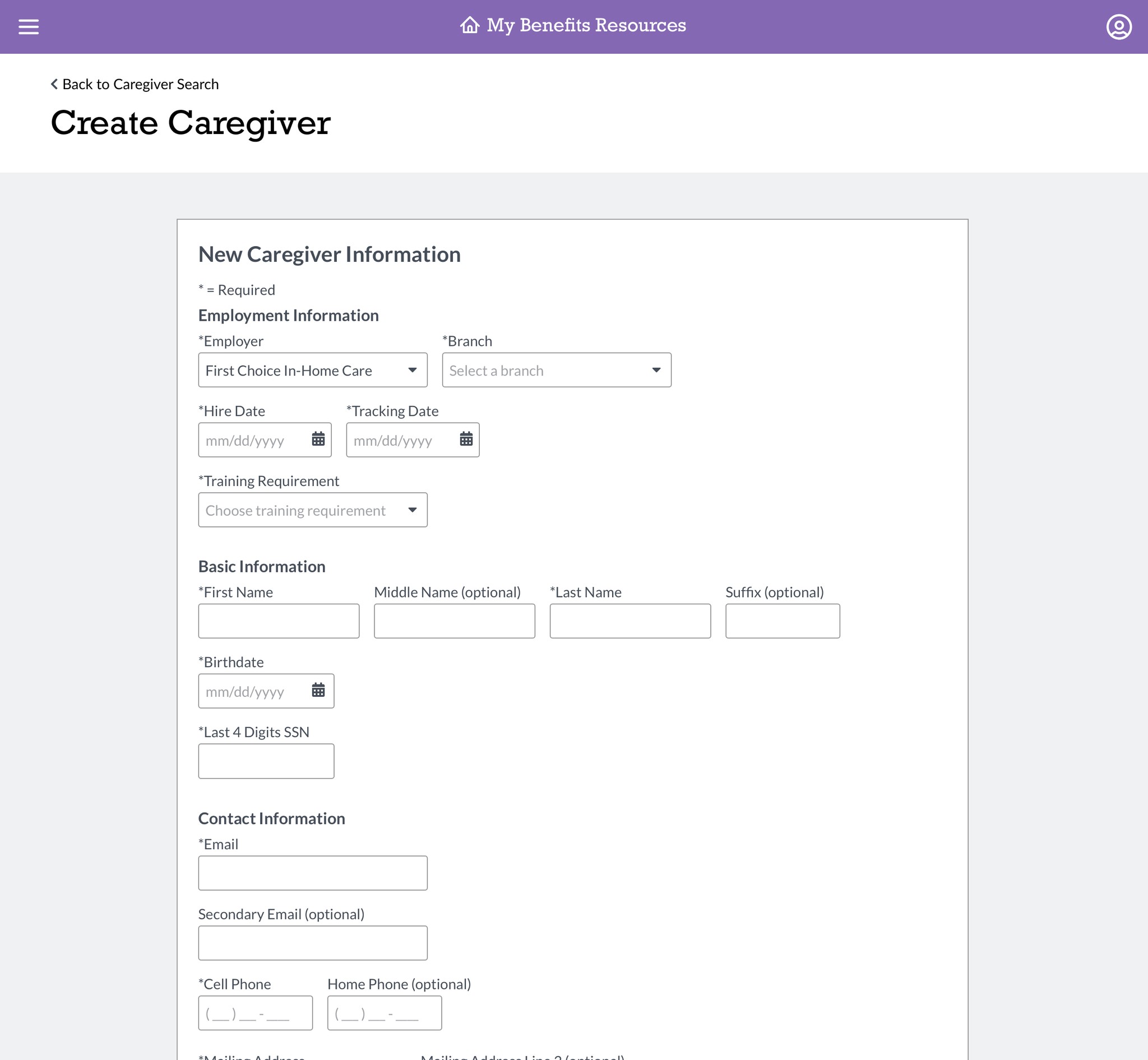
The plan was to start with a minimum viable product version of MBR that supported 14 key user tasks. I designed wireframes for the new platform, including all MVP tasks. but will be focusing on my process for new caregiver search page.
The SalesForce plugin that SEIU 775 Benefits Group (BG) had used for years to provide third-parties with access to caregiver training records was being sunset.
As a replacement, BG leadership decided we would design and develop our own caregiver training management system, dubbed My Benefits Resources (MBR).
The plan was to start with a minimum viable product version of MBR that supported 14 key user tasks. I designed wireframes for the new platform, including all MVP tasks. but will be focusing on my process for new caregiver search page.
Discovery
Learning the lay of the land
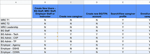
I started by meeting with an internal stakeholder to learn more about the legacy plugin's functionality and the types of users it served. I learned about the following main user groups:
The only starting requirement I had for my redesign was to add support for multi-file uploads and additional filetypes. Because of how open-ended this was, I did some groundwork to establish additional direction for myself.
By conducting a heuristic evaluation of the existing flow and interviewing internal stakeholders about previous customer complaints, I uncovered several additional problem areas that I wanted to address in my redesign.
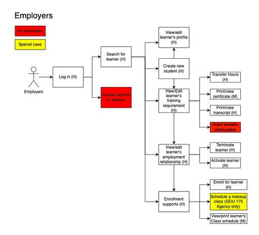
Employers
Employers
Agencies that employ caregivers and manage their training, client assignments, and more
Agencies that employ caregivers and manage their training, client assignments, and more
Member Resource Center (MRC)
Member Resource Center (MRC)
An SEIU 775-affiliated call center that supports caregivers with issues involving training, healthcare, and benefits
An SEIU 775-affiliated call center that supports caregivers with issues involving training, healthcare, and benefits
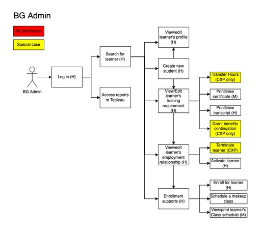
SEIU 775 BG Admins
SEIU 775 BG Admins
Individuals across various teams within the BG who can perform services on behalf of other BG teams or caregivers
Individuals across various teams within the BG who can perform services on behalf of other BG teams or caregivers
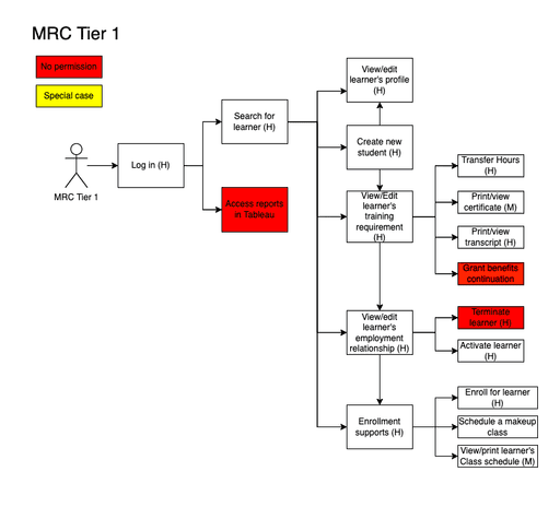
Additionally, each group had subgroups with unique system permissions, so preserving this structure in MBR was key to a successful launch. I tracked everything in a spreadsheet that I shared with teammates and stakeholders to ensure accuracy.
The only starting requirement I had for my redesign was to add support for multi-file uploads and additional filetypes. Because of how open-ended this was, I did some groundwork to establish additional direction for myself.
By conducting a heuristic evaluation of the existing flow and interviewing internal stakeholders about previous customer complaints, I uncovered several additional problem areas that I wanted to address in my redesign.
I also mapped out information architecture diagrams of the legacy system for each main user group. I used these as starting points when designing the architecture and task flows for MBR, as users would already be familiar with them.
The only starting requirement I had for my redesign was to add support for multi-file uploads and additional filetypes. Because of how open-ended this was, I did some groundwork to establish additional direction for myself.
By conducting a heuristic evaluation of the existing flow and interviewing internal stakeholders about previous customer complaints, I uncovered several additional problem areas that I wanted to address in my redesign.
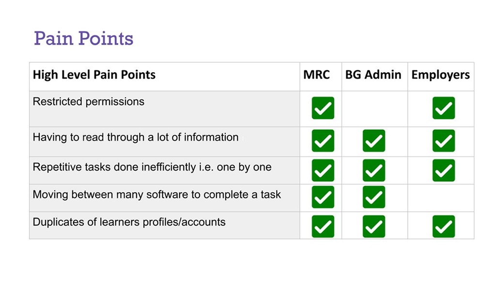
During initial user interviews, our UX Researcher uncovered high level pain points that were experienced across user groups. I made it my objective to solve these pain points in my designs for MBR and based my decisions around them.
During initial user interviews, our UX Researcher uncovered high level pain points that were experienced across user groups. I made it my objective to solve these pain points in my designs for MBR and based my decisions around them.
Define
Narrowing it down
The rest of this case study will focus on my work on the Caregiver Search page. Of the discovered pain points, two were particularly relevant given the functionality and context of the caregiver search page:
The rest of this case study will focus on my work on the Caregiver Search page. Of the discovered pain points, two were particularly relevant given the functionality and context of the caregiver search page:
Having to read through a lot of information
Having to read through a lot of information
There are multiple areas where the legacy system presents too much information at once. This can cause cognitive overload and has lead users to miss crucial information or CTAs
There are multiple areas where the legacy system presents too much information at once. This can cause cognitive overload and has lead users to miss crucial information or CTAs
Duplicate caregiver profiles
Duplicate caregiver profiles
Sometimes users will mistakenly create a duplicate profile for a caregiver that already exists within the system. These duplicate profiles clutter the database and make it more difficult for users to find the right profile.
Sometimes users will mistakenly create a duplicate profile for a caregiver that already exists within the system. These duplicate profiles clutter the database and make it more difficult for users to find the right profile.
Ideation
Ideation
Reduce, reuse, recycle
I used the design and flow of the current caregiver search page as a starting point for my ideation. Reusing parts of the legacy page let me focus on making improvements to the user experience, rather than starting from scratch.
I used the design and flow of the current caregiver search page as a starting point for my ideation. Reusing parts of the legacy page let me focus on making improvements to the user experience, rather than starting from scratch.
Cleaning up the existing UI
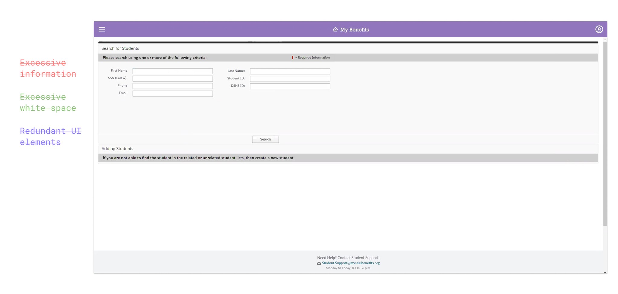
To start, I frankensteined a mockup of what the existing UI could look like with improved visual hierarchy and reduced info overload. I did this by covering up parts of the page and copy-pasting elements on top of it. This worked great as a quick and dirty way to test out layout ideas before further committing to them.
To start, I frankensteined a mockup of what the existing UI could look like with improved visual hierarchy and reduced info overload. I did this by covering up parts of the page and copy-pasting elements on top of it. This worked great as a quick and dirty way to test out layout ideas before further committing to them.
Before…
After…
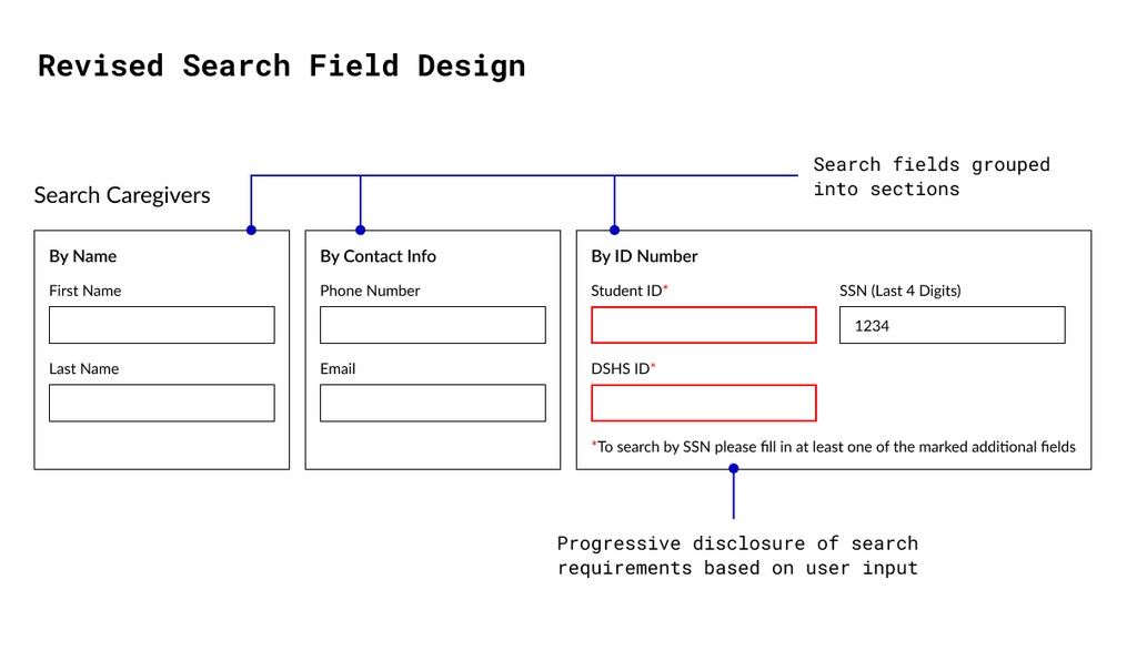
Search fields and requirements
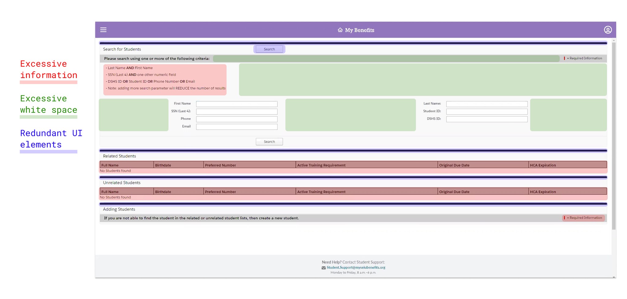
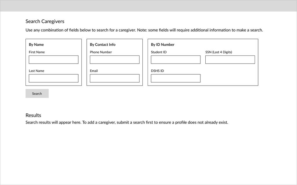
In the current system, users are presented with 7 input fields for making a search. Some of these fields must also be used in a specific combination to make a valid search query. This makes for an overwhelming experience, especially for first-time users.
In the current system, users are presented with 7 input fields for making a search. Some of these fields must also be used in a specific combination to make a valid search query. This makes for an overwhelming experience, especially for first-time users.
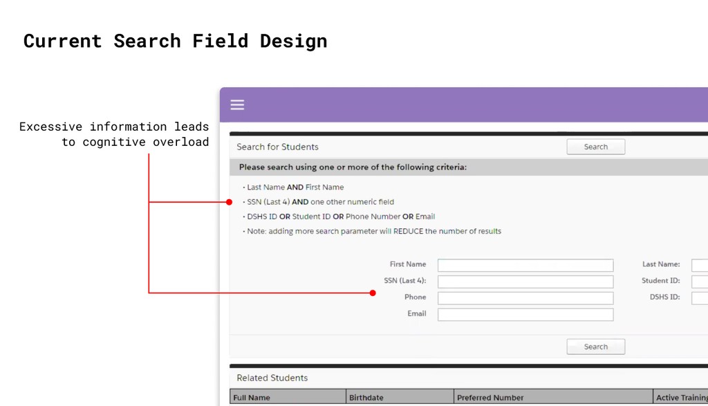
To address this, I grouped the fields based on their search combination requirements and added clear headers. I also removed the bulleted list of requirements in favor of highlighting the required fields depending on the user’s initial input.
To address this, I grouped the fields based on their search combination requirements and added clear headers. I also removed the bulleted list of requirements in favor of highlighting the required fields depending on the user’s initial input.
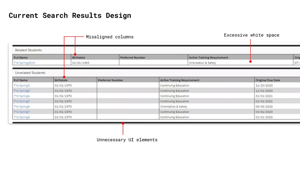
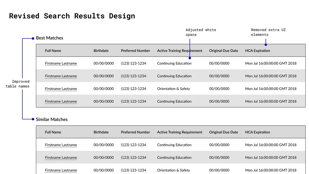
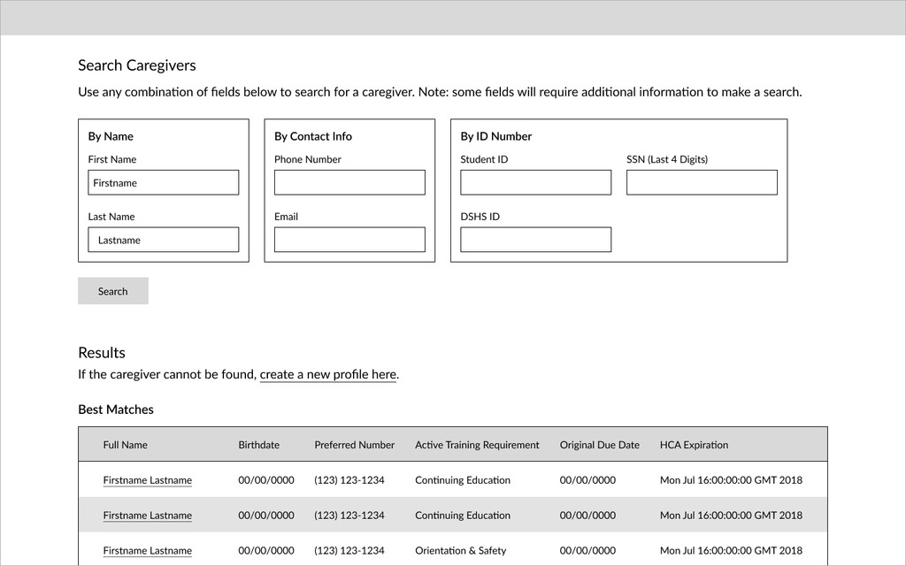
Search results
My design for the search results was comparatively simple. I aimed to improve the readability of the results by removing visual clutter, aligning the Related and Unrelated table columns, and adjusting white space.
My design for the search results was comparatively simple. I aimed to improve the readability of the results by removing visual clutter, aligning the Related and Unrelated table columns, and adjusting white space.
Add caregiver feature
Certain user groups also have the option to add new caregivers to the database. However, very little information is shown on the search page about this process.
Certain user groups also have the option to add new caregivers to the database. However, very little information is shown on the search page about this process.
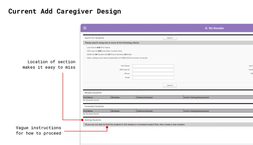
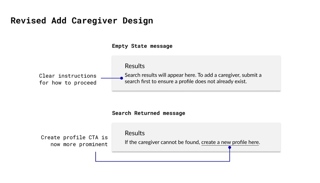
To improve this, I removed the Adding Students section and added actionable helper text underneath the Search Results header, where it is more visible.
To improve this, I removed the Adding Students section and added actionable helper text underneath the Search Results header, where it is more visible.
Putting it all together
I combined all the solutions that I had explored to create a low-fidelity mockup of how the caregiver search page might look and function within the new system.
I combined all the solutions that I had explored to create a low-fidelity mockup of how the caregiver search page might look and function within the new system.
Iteration
Iteration
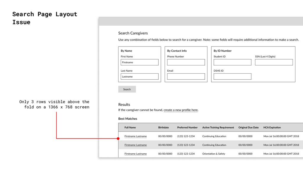
Revising the layout
During a weekly design review, a teammate noted that my search page design only showed 3 results above the fold. This was far fewer than the legacy design.
This made me realize that I had been so focused on working within the bounds of the existing search page's design that I hadn't considered alternatives to the top-down layout.
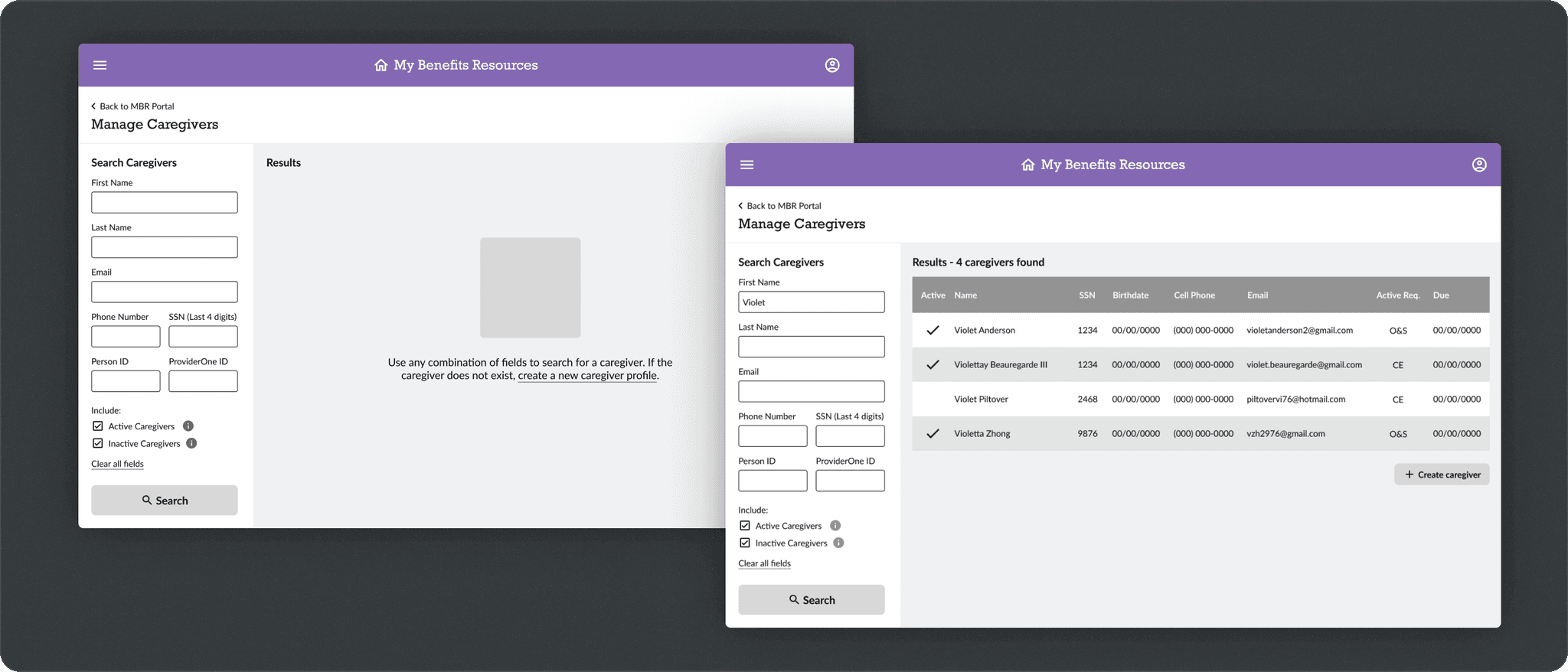
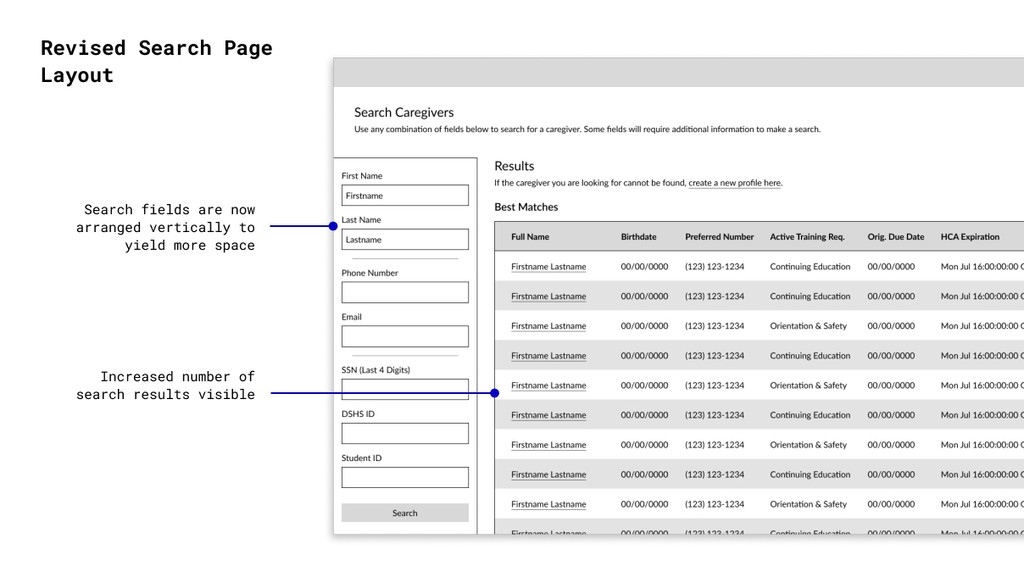
After some exploration, I settled on a new layout that placed the search fields side-by-side with the results. This allowed for more than thrice the amount of search results to be displayed above the fold than in my previous one.
After some exploration, I settled on a new layout that placed the search fields side-by-side with the results. This allowed for more than thrice the amount of search results to be displayed above the fold than in my previous one.
Usability Testing
Once I had completed wireframes for all MVP user tasks, my team and I ran internal usability tests with 8 participants. These were meant to ensure that all 14 key user tasks were achievable within my designs.
Three of the tasks involved the caregiver search page, which all 8 participants successfully completed. During the "create a new caregiver" task, we uncovered some interesting feedback…
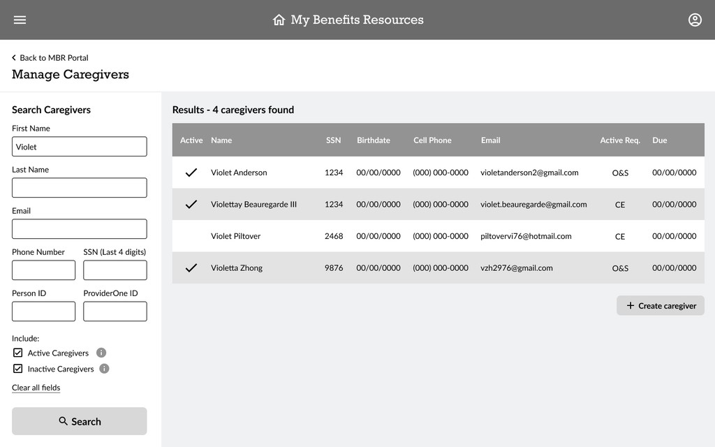
2/8 participants
mentioned confusion over the two search results tables
mentioned confusion over the two search results tables
3/8 participants
disliked the need to search before creating a new profile
disliked the need to search before creating a new profile
The 3 participants
mentioned using "throwaway" searches to reach the button
mentioned using "throwaway" searches to reach the button
Final Iteration
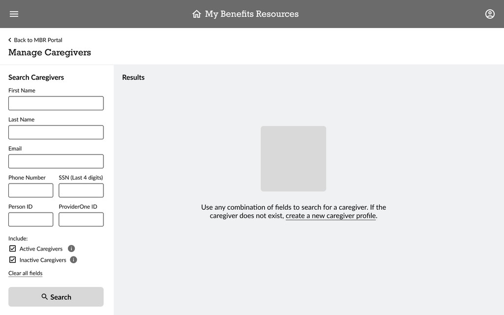
After hearing the discontent over the imposed friction in the profile creation flow, I included the option to create a profile up front in my next iteration. I also got confirmation from stakeholders that we could merge the two search results tables.
In addition, I made adjustments to my designs based on new requirements that I received from stakeholders, which included:
Removing search field combination requirements. These will no longer be relevant in the new system.
Removing search field combination requirements. These will no longer be relevant in the new system.
Displaying more data in the search results to make caregiver identification easier in light of the new possible queries.
Displaying more data in the search results to make caregiver identification easier in light of the new possible queries.
Adding new search filters requested by stakeholders and an option to clear all search fields as a QoL improvement.
Adding new search filters requested by stakeholders and an option to clear all search fields as a QoL improvement.
Outcomes
Outcomes
If I had more time…
Unfortunately, leadership put the My Benefits Resources project on hold in April 2021 to focus on other priorities. As a result, I did not have the chance to see my designs implemented or measure their impact.
Had I continued, there were several metrics that I would have wanted to monitor in order to evaluate my work…
Task success rate
Task success rate
While my caregiver search page design had a 100% task success rate, I would want to retest my finalized design at scale with participants across all user groups.
While my caregiver search page design had a 100% task success rate, I would want to retest my finalized design at scale with participants across all user groups.
Error rates
Error rates
A decline in the number of duplicate profiles created or average number of searches required to find a profile all could be indicative of a successful design.
A decline in the number of duplicate profiles created or average number of searches required to find a profile all could be indicative of a successful design.
User satisfaction
User satisfaction
This could be measured with a brief satisfaction questionnaire or a follow-up interview to determine whether previous pain points for adequately resolved.
This could be measured with a brief satisfaction questionnaire or a follow-up interview to determine whether previous pain points for adequately resolved.
Reflection
Takeaways
This was one of the longest continuous projects that I've had the privilege to work on and it was filled with learning lessons. Some of my main takeaways were…
This was one of the longest continuous projects that I've had the privilege to work on and it was filled with learning lessons. Some of my main takeaways were…
Leave no stone unturned
Leave no stone unturned
Take time to generate as many ideas as possible, even with a pre-existing option. Considering a wider range of possibilities makes you more aware of the pros and cons of each.
Take time to generate as many ideas as possible, even with a pre-existing option. Considering a wider range of possibilities makes you more aware of the pros and cons of each.
The more feedback, the merrier
The more feedback, the merrier
Regularly showing my work to others helped promote a diversity of ideas, eliminate personal biases, and prevent tunnel visioning.
Regularly showing my work to others helped promote a diversity of ideas, eliminate personal biases, and prevent tunnel visioning.
Deliverables
Deliverables
Additional Wireframes