Iterating on a Comic Reader Mobile App

STELA
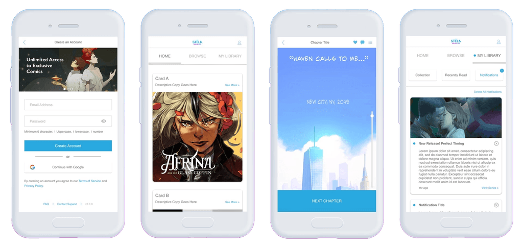
STELA is a digital comics publication company that offers access to their library of comics through a paid subscription. Subscribers can browse and read comics using the STELA mobile app for Android & iOS.
During my time at STELA, I designed various features and improvements for an upcoming version 2.0 of the app. This case study focuses on my work on a new commenting feature.
My Role
UX Designer
Team
Andrew S., UI Designer
Timeline
May 2019 - Aug 2019
Context
Context
Meeting the competition with STELA 2.0
Version 1.X of the STELA app established the core user experience but still lacked key features needed for competitive parity and differentiation. To advance the business' goals of increasing subscriber retention and conversion, version 2.0 had to deliver on these missing features and improve upon existing ones.
As the sole UX Designer, I conducted user research and produced low-fi wireframes, wireflows and other deliverables for all of the features to be included in STELA 2.0.
Discovery
Getting acquainted with the users
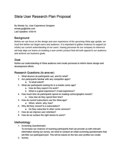
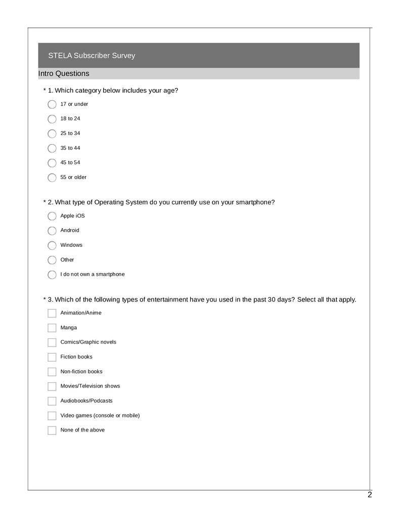
I started by learning about our users so that I could center my design work around them. I planned an online survey and follow-up interviews with STELA subscribers. My goal was to develop user personas to inform product decisions for STELA v2 and beyond.
After several revisions and getting stakeholder signoff, I emailed the survey that I had created to over 300 current STELA subscribers.
The only starting requirement I had for my redesign was to add support for multi-file uploads and additional filetypes. Because of how open-ended this was, I did some groundwork to establish additional direction for myself.
By conducting a heuristic evaluation of the existing flow and interviewing internal stakeholders about previous customer complaints, I uncovered several additional problem areas that I wanted to address in my redesign.
What I learned…
First of all, I had been much too optimistic about the response rate. I wanted at least 169 responses for statistically significant results from a "population" of 300. After two weeks, I had collected a whopping total of 5 survey responses.
I quickly realized that statistical significance wouldn’t be feasible, but still gained valuable insights from the five responses that I received.
The only starting requirement I had for my redesign was to add support for multi-file uploads and additional filetypes. Because of how open-ended this was, I did some groundwork to establish additional direction for myself.
By conducting a heuristic evaluation of the existing flow and interviewing internal stakeholders about previous customer complaints, I uncovered several additional problem areas that I wanted to address in my redesign.
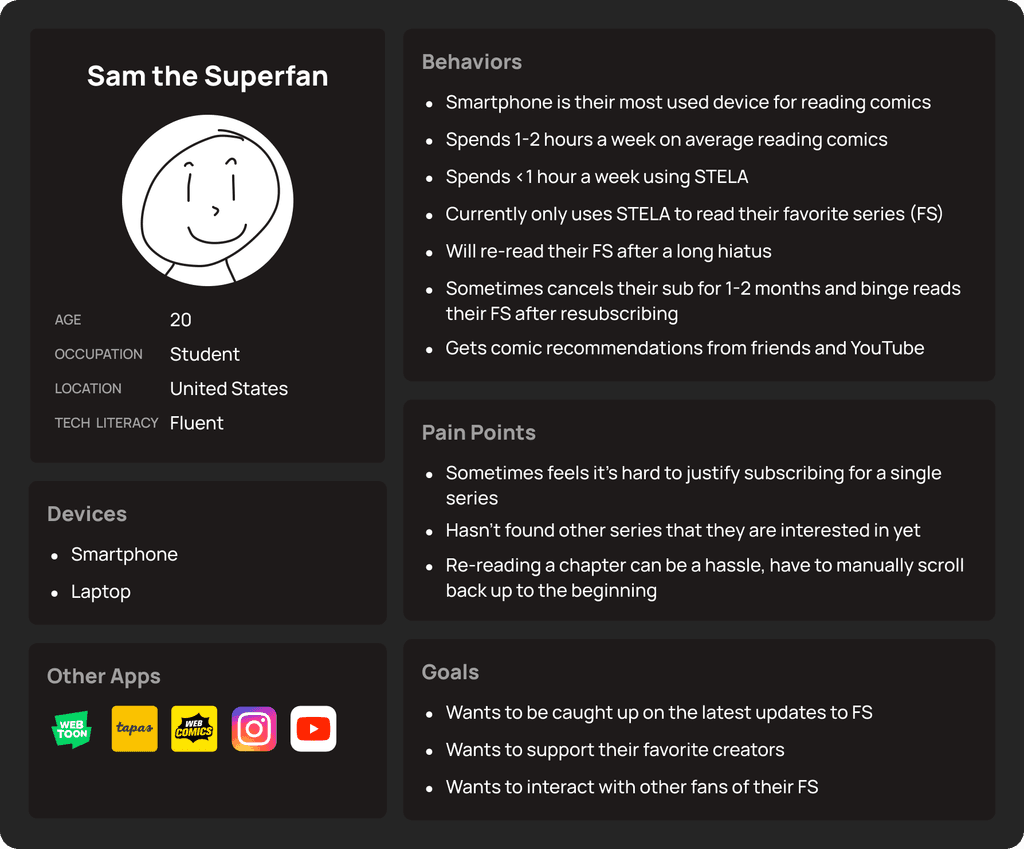
100% of participants
use smartphone as primary device to read comics
use smartphone as primary device to read comics
60% of participants
subscribed to read one specific comic series
subscribed to read one specific comic series
80% of participants
use STELA for less than 1 hour per week
use STELA for less than 1 hour per week
Of these five respondents, I was only able to interview one of them. I learned that the interviewee…
Of these five respondents, I was only able to interview one of them. I learned that the interviewee…
Mainly subscribes to read (and re-read) their favorite series
"A friend found out about [series name] and told me. I've been subscribing as much as I could for it."
"A friend found out about [series name] and told me. I've been subscribing as much as I could for it."
"…honestly I’m not terribly interested in most of the other comics…"
"…honestly I’m not terribly interested in most of the other comics…"
"I’d say I re-read every couple months, if I’ve forgotten pieces of it then I’ll want to reread through. Or if I want to show someone else, I'll go back…"
"I’d say I re-read every couple months, if I’ve forgotten pieces of it then I’ll want to reread through. Or if I want to show someone else, I'll go back…"
Will sometimes cancel their subscription and resume it later to catch up on their favorite series
"...I'll have to drop the subscription for like a month or two. And then I'll renew it again and catch up super quickly..."
"...I'll have to drop the subscription for like a month or two. And then I'll renew it again and catch up super quickly..."
"I’ll also stay subscribed for a while and read each [chapter] as it comes out."
"I’ll also stay subscribed for a while and read each [chapter] as it comes out."
Wants to interact with other fans of their favorite series
"Outside of the one friend that introduced me, I don't know anyone else personally that uses STELA."
"Outside of the one friend that introduced me, I don't know anyone else personally that uses STELA."
"I'd love it if there was a way to interact with other fans of [series name] in the app…"
"I'd love it if there was a way to interact with other fans of [series name] in the app…"
Putting a face to the data
Using what I had gathered from the survey and interview, I created a persona named Sam to summarize key findings. Despite the small sample size, Sam was a solid starting point for my designs.
Using what I had gathered from the survey and interview, I created a persona named Sam to summarize key findings. Despite the small sample size, Sam was a solid starting point for my designs.
An ad hoc hypothesis
Something that stuck with me was the interview participant's habit of canceling and re-subscribing every few months to catch up on their favorite series. I wondered why this might be happening (outside of budgetary reasons) and how we could get users like Sam to retain their subscriptions.
I hypothesized that because the sole form of engagement in the app is reading comics, superfans who are only interested one series use the app infrequently, making them less likely to consecutively renew.
Ideation
Ideation
Driving engagement through comments
As part of STELA v2, I was tasked with exploring social features to add to our app. I brainstormed various approaches with stakeholders and ultimately chose to pursue comment sections.
This was the perfect opportunity to test my hypothesis. A commenting feature could help retain users like Sam by keeping them engaged in between series updates.
I began by auditing the comment sections of the competing apps that our survey respondents reported using.

I noticed several things that these apps all had in common:
I noticed several things that these apps all had in common:
Separate comment sections for each chapter of a series
Separate comment sections for each chapter of a series
Option to "like" user comments
Option to "like" user comments
Option to reply to user comments
Option to reply to user comments
Option to sort user comments
Option to sort user comments
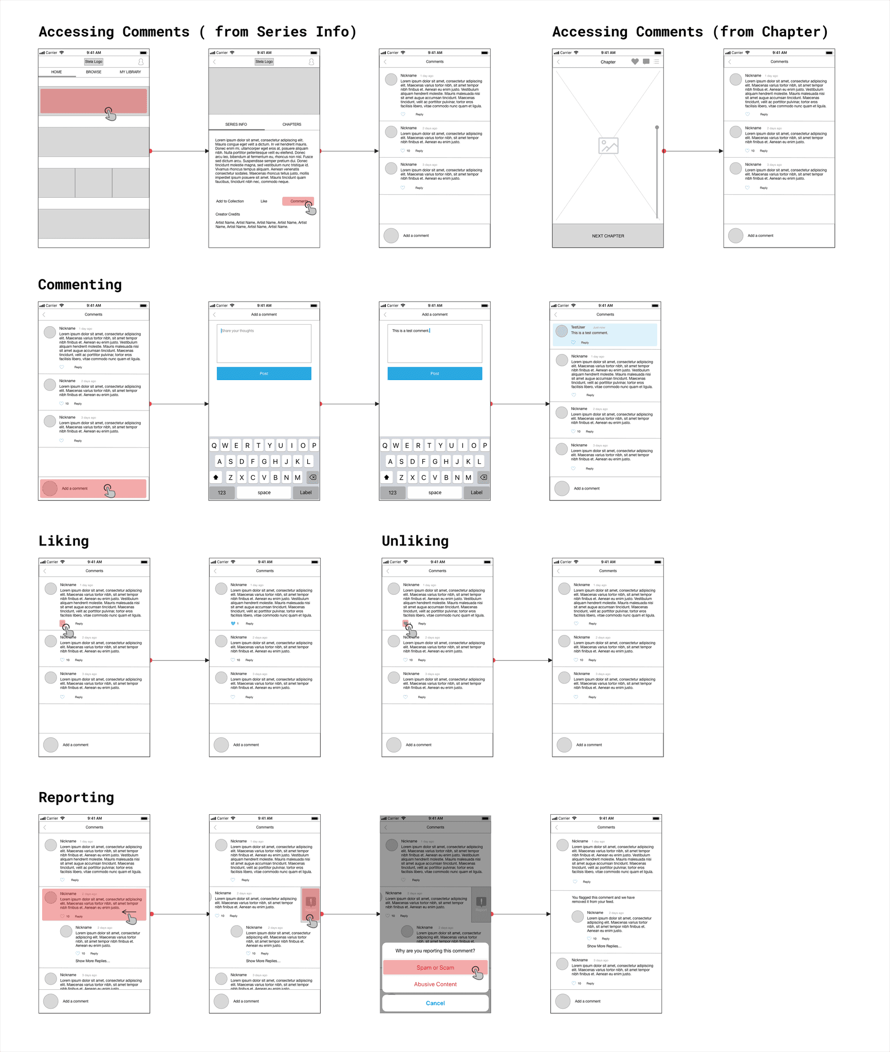
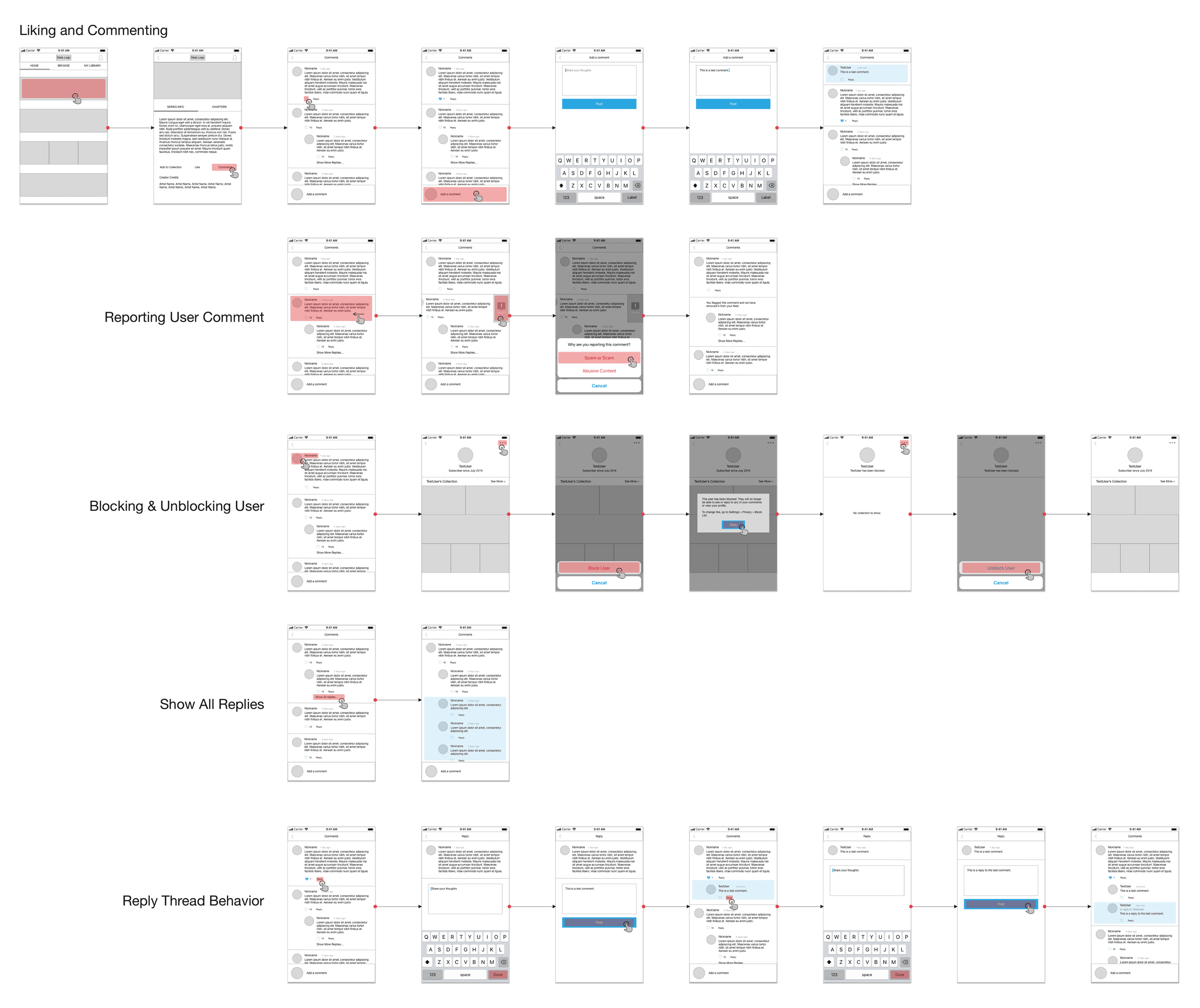
With these elements in mind, I began exploring what the commenting experience in STELA could look like.
With these elements in mind, I began exploring what the commenting experience in STELA could look like.
Layout
Before diving into details, I mapped how commenting could fit into the app by creating an information architecture diagram and user flow sketches.
Before diving into details, I mapped how commenting could fit into the app by creating an information architecture diagram and user flow sketches.


Since comments and replies were likely to build up over time in these sections, organization was critical to help users read and interact with the comments that interest them.
I opted for a "teased capped" design, which was a balance between easy comment scanning and the ability to dive deeper into specific reply threads. Showing "teaser replies" could also grab attention and spark further user engagement.


Comment design
As for the design of the comments themselves, I followed common design patterns from competitor apps. These elements were essential for facilitating interaction and engagement.
As for the design of the comments themselves, I followed common design patterns from competitor apps. These elements were essential for facilitating interaction and engagement.

Options for sorting
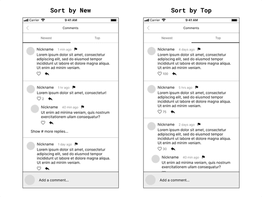
I also wanted to include sorting options for the comment sections. Letting users sort by "newest" or "most liked" would further organize the section and boost engagement by highlighting new and popular discussions.
I also wanted to include sorting options for the comment sections. Letting users sort by "newest" or "most liked" would further organize the section and boost engagement by highlighting new and popular discussions.
Iteration
Iteration
Strategic simplification
After building my vision for commenting in STELA, I shared my designs with my manager. He appreciated the work but suggested that features like sorting and reply threads be held for a future iteration.
At first, I disagreed. These features were all present in the comic apps that I audited, and had strong potential for increasing user engagement. Removing them would detract from our app's user experience.
He reminded me that with the other v2 initiatives underway, engineering was already stretched thin. Narrowing the scope would help us launch faster and we could iterate after getting actual user feedback.
This perspective made everything click. I took his feedback and simplified my designs, setting aside certain features for a later date.

Outcomes
Outcomes
If I had more time…
Sadly, due to funding issues, I was laid off from STELA before I could see my designs actualized. If I had more time, there were several things that I would like to have done.
Sadly, due to funding issues, I was laid off from STELA before I could see my designs actualized. If I had more time, there were several things that I would like to have done.
Continuing user research
Continuing user research
To collect more responses, I'd want to try alternative outreach methods (e.g. in-app surveys), widen my recruitment criteria, and reduce the number and scope of the survey questions.
To collect more responses, I'd want to try alternative outreach methods (e.g. in-app surveys), widen my recruitment criteria, and reduce the number and scope of the survey questions.
Checking app metrics
Checking app metrics
Unfortunately, I didn't get to review our app metrics. I could have used these to influence design direction, set success criteria for my work, and cross-check my research findings.
Unfortunately, I didn't get to review our app metrics. I could have used these to influence design direction, set success criteria for my work, and cross-check my research findings.
Evaluating my designs (and hypothesis)
Evaluating my designs (and hypothesis)
Conducting usability tests and monitoring metrics after release, with special attention to conversion, retention, user engagement, and time spent in app.
Conducting usability tests and monitoring metrics after release, with special attention to conversion, retention, user engagement, and time spent in app.
Reflection
Takeaways
Working at STELA as the sole UX Designer challenged me to grow in many ways. In addition to leveling up my design skills, I also gained experience with user research, project management, and leading workshops.
Some key takeaways from working on this project were:
Working at STELA as the sole UX Designer challenged me to grow in many ways. In addition to leveling up my design skills, I also gained experience with user research, project management, and leading workshops.
Some key takeaways from working on this project were:
Balance user needs with business realities
Balance user needs with business realities
While my priority as a UX Designer is to champion the user, I also need to consider the implications of my work on other teams and follow the constraints of the business.
While my priority as a UX Designer is to champion the user, I also need to consider the implications of my work on other teams and follow the constraints of the business.
Start small, then build it bigger
Start small, then build it bigger
Keeping the first release simple speeds up the time to launch and gets your product to real users sooner for faster feedback. This avoids time spent over-designing a feature that under-performs.
Keeping the first release simple speeds up the time to launch and gets your product to real users sooner for faster feedback. This avoids time spent over-designing a feature that under-performs.
Deliverables
Deliverables
Wireflows
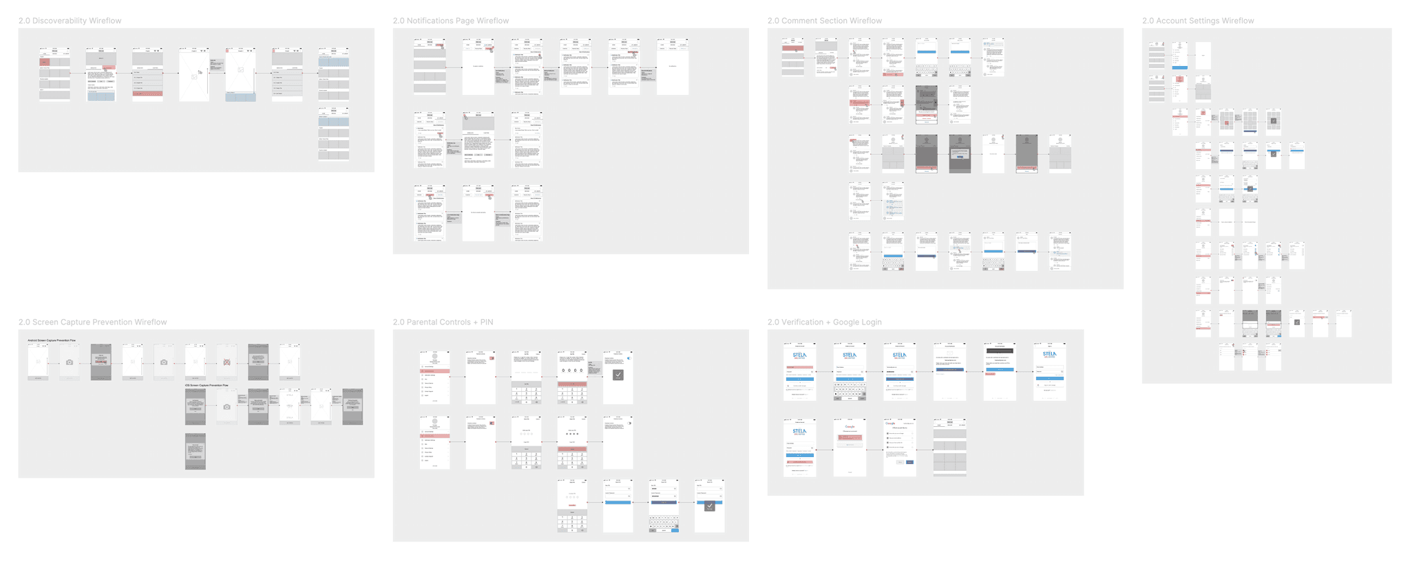
Information Architecture Map
